


Building A1 DDP - Dubai Silicon Oasis
Industrial Area - 342001 -
Dubai - United Arab Emirates
+971 50 756 2346


SERVICES

COMPANY LINKS
SIGN-UP
For Newsletter


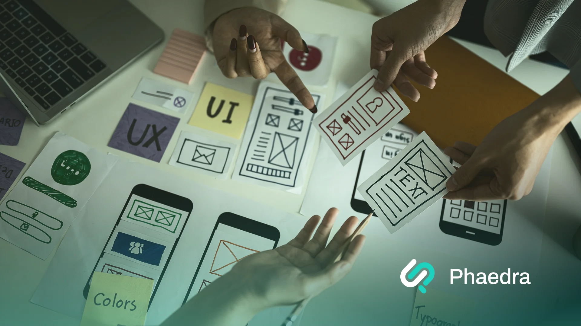
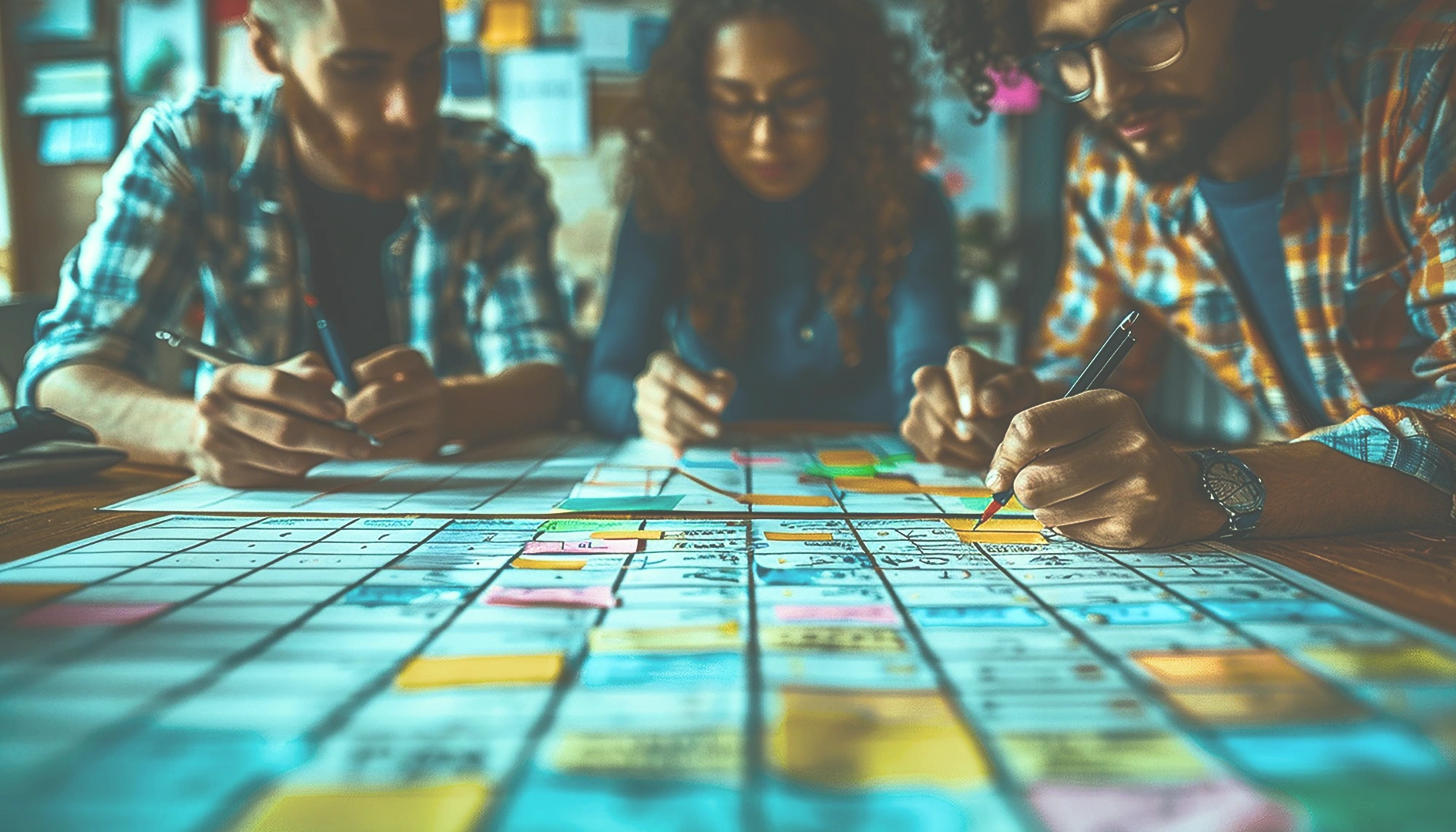
Over the years, I’ve noticed a big shift in how people think about collaborative UX design, or just design in general.
It’s no longer something only designers talk about. Developers discuss layouts, marketers care about visuals, writers focus on tone, and project managers analyze user journeys.
And don’t get me wrong, that’s great! It shows exactly how much ‘design thinking’ has spread across different fields.
But sometimes, I’ve seen something else happen too.
Everyone starts having their own idea of what “good design” means, and slowly the focus moves away from the user and more toward personal opinions.
That’s what I call a “Design Monopoly.”
Don Norman, in The Design of Everyday Things, said:
“Design is really an act of communication, which means having a deep understanding of the person with whom the designer is communicating.”
When each person focuses only on their own perspective, that understanding and that communication gets lost.
Being a Brand & UI/UX Designer for the past 5 years, I’ve had the chance to work with diverse teams (each with its own approach to design and collaboration).
Currently at Phaedra Solutions, I continue to explore new challenges and innovations in how teams work together, learn faster, and stay truly user-focused.
I wanted to write this piece because I’ve seen firsthand how projects can lose direction not because of bad ideas, but because of too many opinions and too little alignment.
That’s why I wanted to write about collaborative UX design to show what actually works when teams build together.
Here’s what I hope readers take away:
Because when every role contributes to the same goal, design stops being personal. It starts being powerful.
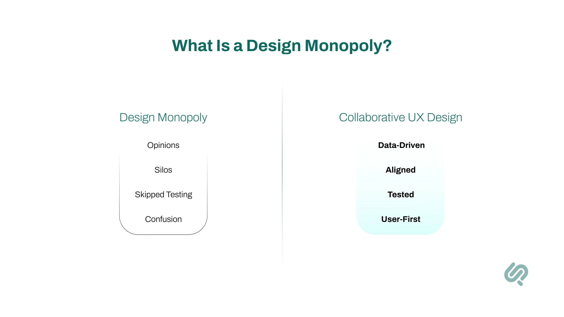
A design monopoly occurs when different stakeholders push their own idea of “good design,” and the focus drifts from the user to personal opinions, so the shared understanding (and communication) breaks down.
In my experience, a design monopoly shows up when:
The fix isn’t complicated.
Bring it back to collaborative UX design.
Run small usability tests. Share insights openly. Decide with data, not ego. When teams align around real evidence, design becomes something shared, not owned.
That’s where great, user-centred design starts to happen again.
One thing I’ve learned in my experience is that user experience (UX) is not just a designer’s responsibility.
Every person who touches the product plays a role in shaping it. Even improving render time from ~900ms to ~600ms is UX — users finish tasks faster.
Some other examples of UX that people often overlook:
The best products I’ve worked on were created by teams where everyone cared about the user, not just their own task list.
That shared mindset leads to smoother, more natural experiences.
But problems begin when each person tries to “lead” the design process alone.
That’s when the “Design Monopoly” shows up, when the user’s needs are replaced by personal preferences.
In collaborative UX design, each role contributes toward a single user outcome.

To understand how design truly works, it helps to know the different roles within the UX process. Each one focuses on a specific part of creating a great experience:
Each role is different, but they all share one mission, to make the experience effortless and meaningful for the user.
That’s why collaboration matters more than control. When every role respects the other, design becomes a shared success instead of a competition.
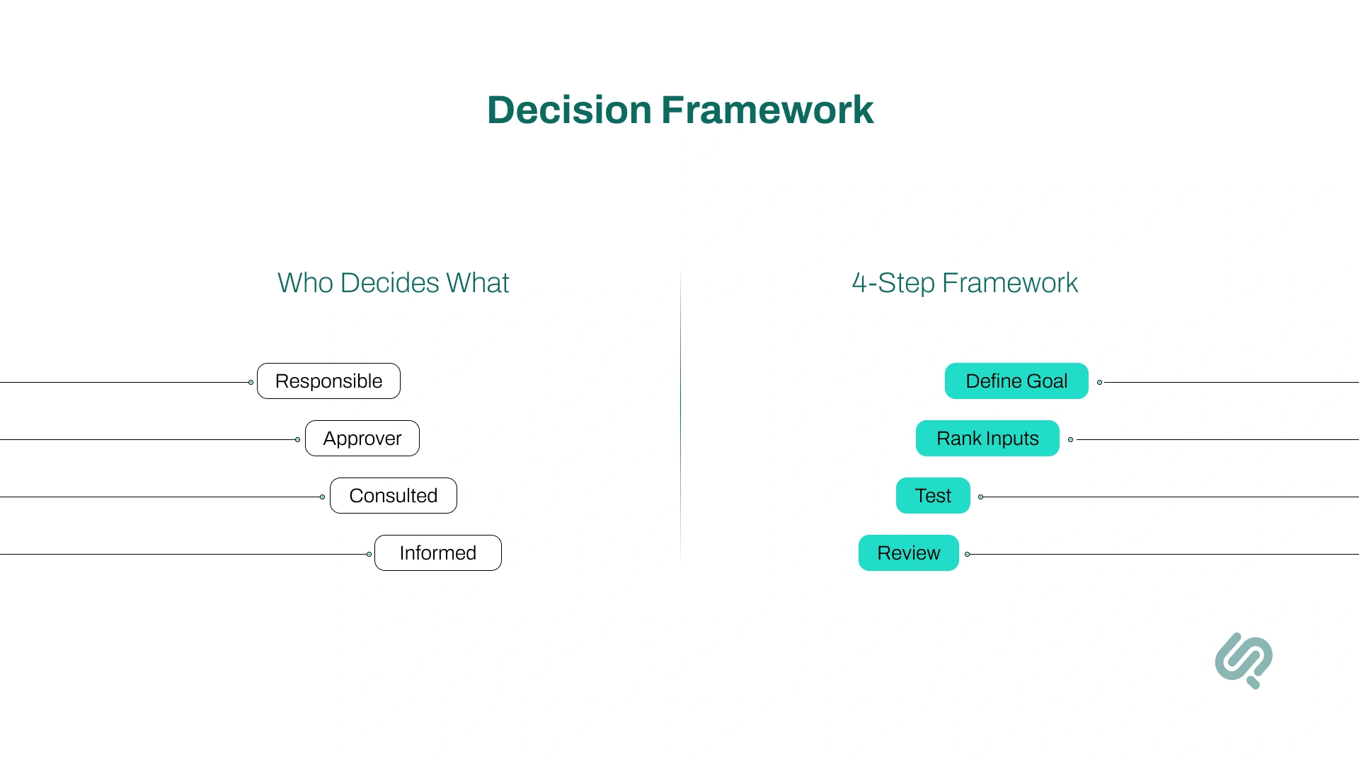
In every project, clarity on who decides what is essential. Without it, teams fall into opinion battles, the perfect setup for a design monopoly.
Here’s how I like to keep decision-making simple, balanced, and user-focused.
Think of this as a one-page decision map for the team:
I follow a simple 4-step framework to keep decisions evidence-driven:
Define what success looks like, for example, “task success rate above 85%” or “checkout time under 1 minute.”
Always weigh decisions in this order: User evidence > Business goals > Expert judgment > Personal taste.
Time-box debates. Test the strongest idea instead of arguing endlessly.
Once live, check how users actually respond. If it works, keep it. If not, learn and adjust.
This approach keeps collaboration structured but flexible. Everyone gets a voice — yet the user’s voice stays loudest.
Over the years, I’ve learned that collaborative UX design isn’t just about working together. It’s about creating an environment where every role contributes to a shared user outcome.
Here’s what that looks like in practice, and why it makes such a difference.
Having a clear goal keeps everyone aligned.
When the team rallies around measurable user success instead of opinions, discussions become purposeful — and results become visible.
Clarity beats chaos.
Knowing who researches, who decides, and who publishes prevents overlap and friction. It saves time, avoids ego clashes, and helps the team move faster.
I’ve seen too many debates where “I like it better” wins.
The rule of evidence-first design ends that. When user data leads, decisions feel lighter, faster, and more confident.
Testing small, testing often, that’s how we stay grounded.
Talking to real users regularly keeps us from drifting into assumptions or personal biases.
Speed is part of experience.
A fast interface feels intuitive even before a user reads a word. Improving load time is often the simplest way to make design feel “better.”
Words are design too.
Clear, friendly microcopy helps users trust the product. I’ve seen a single well-placed sentence reduce confusion more effectively than a layout change.
Every release is a learning moment.
Reviewing outcomes, not just aesthetics, builds accountability and continuous improvement into the team’s rhythm.
When collaboration improves, you can feel it, fewer debates, smoother handoffs, happier users. But it helps to measure it too.
Here are the key metrics I track to see if collaborative UX design is really paying off.
This shows how many users can complete a task without help.
If 8 out of 10 users finish checkout or sign-up smoothly, your TSR is 80%.
When teams collaborate well, designers simplify flows, developers improve speed, and writers clarify steps, this number goes up.
Example: TSR improved from 71% → 84% after we aligned our design and dev teams on one shared prototype.
This measures how long it takes users to finish key actions, like booking a demo or creating an account.
Shorter times usually mean cleaner UX and better teamwork.
If your signup used to take 90 seconds and now takes 45, that’s collaboration working in the background: fewer steps, faster load times, clearer text.
The fewer support messages you get, the clearer your design is.
If people don’t need to ask questions, your UX is doing its job.
For example, when we rewrote error messages and simplified a checkout form, support tickets dropped by 27% in one week.
SUS (System Usability Scale) and CSAT (Customer Satisfaction) measure how easy users feel your product is.
Think of it as a “Would you recommend this?” check.
When designers, writers, and developers work together, these scores naturally rise, because the product feels cohesive, not cobbled together.
This shows how many users move through each stage, from “Visit” → “Add to Cart” → “Purchase.”
Collaboration impacts this directly: fewer confusing steps and smoother performance mean more people make it to the end.
If drop-off between “Add to Cart” and “Payment” shrinks from 35% to 20%, your collaborative UX decisions are paying off.
UX Laws & Myths
There’s a common myth in UX design: “We must follow every UX law all the time.” (1)
When I first started, I believed this too. I tried to apply every UX design principle Hick’s Law (2), Fitts’s Law (3), the Law of Proximity (4) into every project.
For example, on mobile pricing sections, we implemented Hick’s Law by merging three plan buttons into a single CTA + expand. This resulted in the completion rate going up by 11%.
So, sure, the rules were great and yielded results. However, over time, I learned something valuable:
UX laws are guides, not rules.
These laws are based on psychology and research about how people interact with things. They’re meant to help designers make thoughtful decisions, not to restrict creativity.
Sometimes, breaking a UX law can actually lead to a better design, if it solves the user’s problem more effectively.
Don Norman reminds us:
“Rules are good. But they are meant to be broken, when you understand why they exist.”
And Austin Kleon, in Steal Like an Artist, says:
“Learn the rules like a pro, so you can break them like an artist.”
That line perfectly sums up how UX laws should be used.
If you understand the purpose behind a law, and you’re solving a real problem, then breaking it isn’t wrong. It’s innovation.
Following UX laws blindly can make designs feel robotic and predictable. But using them with intention, or breaking them with understanding, makes your work thoughtful, original, and human-centered.
Austin Kleon, in Steal Like an Artist, wrote:
“You don’t need to be a genius, you just need to be yourself.”
That quote reminds me that design isn’t about showing who knows best, it’s about building something together that feels right for people.
Ask yourself:
Remember, every team member brings a different kind of creativity. Developers bring logic, writers bring empathy, designers bring visual balance, and marketers bring connection.
When these perspectives blend, design becomes stronger.
When they compete, it starts to lose its purpose.
True collaboration means letting creativity flow without letting ego lead.
I use a simple rule: if a tool helps the whole team see users more clearly, and act faster together, it earns a spot in our tool stack.
These five UX design tools are pushing collaboration forward right now (especially useful for anyone trying to get into UI/UX Design):
Real-time design + whiteboarding in one place. Recent launches (Dev Mode, AI/Weave work, and ongoing collab updates) make handoff cleaner and multi-disciplinary work smoother.
Continuous, unmoderated research at the speed of product. Great for quick prototype tests, first-click, card sorting, and now AI-assisted interviews, so insights arrive while we’re still designing.
One home for user interviews, notes, tags, and highlight reels. It turns scattered feedback into searchable, team-wide evidence that actually informs decisions.
From prototype to production, it bundles tests and analytics so cross-functional teams can validate flows without juggling a dozen tools.
Behavior analytics that everyone understands: heatmaps, recordings, and funnels. It’s an easy way to bring real user behavior into standups and post-ship reviews.
In my own work as a UX designer, I’ve learned that the best outcomes come when everyone, from developers to marketing leads, shares one mindset:
The user comes first.
It’s easy for teams to get lost in opinions and trends, but when decisions are made with empathy, the final design always feels better.
The interface works smoothly.
The words make sense.
The product feels right.
UX isn’t about rules, it’s about people. When a team remembers that, design stops being a monopoly and becomes a collaboration.
In the world of UX, the tools and workflows may change fast.
What stays constant is one thing: teams that design together, iterate together, succeed together. Here are the trends shaping how collaborative UX design is evolving.
Designers, developers, marketers, writers and PMs are working side-by-side (virtually or in-person) rather than passing hand-offs. This results in faster alignment and fewer “us vs them” moments.
Teams are moving beyond aesthetic approvals to tracking task success rate, time-on-task, user satisfaction as joint goals. Shared metrics help everyone stay focused on outcomes.
No longer reserved for once-in-a-while research, usability testing is becoming a continuous habit: 5 users every fortnight, live prototypes, fast feedback loops to inform design decisions.
The trend: flattening decision-rights, giving weight to user insights over personal taste or seniority. Stakeholder alignment is driven by data, not debate.
Speed, load-time, responsiveness: performance is being treated as a UX role, not just a tech worry. Fast interfaces = smoother collaboration and higher user trust.
Writers and designers working together early means microcopy becomes part of the design system, reducing friction and making user flows cleaner.
Rather than “ship and forget,” teams are adopting post-launch metrics checks, iterating based on real user data, closing the loop in the collaborative process.
Design isn’t owned by one person or one department. It’s a shared process that brings together psychology, creativity, and teamwork.
Don Norman said it best:
“It’s not your job to make people understand design. It’s your job to understand people.”
That’s the mindset that keeps design human, and keeps us all working toward the same goal: solving real problems for real people.
Because in the end, great design isn’t about who leads. It’s about how everyone works together to make something truly meaningful.
That’s the core of collaborative UX design, shared evidence, shared outcomes, shared wins.

Shahzaib is a brand and UI/UX designer with 5+ years of experience transforming ideas into user-centred visuals and intuitive experiences.
His work spans brand kits, digital products, and collaborative design systems where user outcome and business impact align. He specialises in making user journeys clearer, interfaces faster, and teams better connected throughout the design process.