You’ve seen it before: a beautiful user interface that completely confuses users.
Maybe it was a mobile app that made checkout hard, or a website that looked great but didn’t guide users anywhere.
When the design process doesn’t center around real users, products lose value fast.
So, how do the best brands get it right?
They study what works through real, tested, and impactful UI design examples and case studies. And that’s what this guide is all about: showing you how industry leaders use responsive design, clear design elements, and seamless user experience flows to keep users engaged.
Here’s what You’ll Learn:
Bad UI drives users away — the majority of users won’t return after a poor experience.
Great design is tested, not guessed — the best examples come from real usability testing.
Responsive design is essential — users access your app on various devices and screen sizes.
Simple interfaces keep users engaged — clean layouts and clear feedback make all the difference.
Personalized UI drives results — smart features based on user behavior boost retention and trust.
It is proven that about 88% of users won’t return to a site after a bad UX. (1)
So, having a good UX design is vital for a business to keep users engaged and satisfied.
UI design (User Interface design) is the process of shaping how a digital product looks and feels so users can interact with it smoothly and efficiently.
It’s more than just making things pretty; it’s about solving problems and guiding people through an app or website. A great design blends UI design principles with smart layouts, clear feedback, and intuitive navigation.
When you learn UI design basics, you’ll discover how colors, typography, icons, and spacing work together to create a seamless user experience.
Visual hierarchy: arranging elements so users know what to focus on first.
Consistency: using repeated patterns and styles across screens for familiarity.
Clarity: keeping layouts simple and avoiding unnecessary clutter.
Responsiveness: ensuring designs work well on different devices.
Feedback: providing clear signals so users know what’s happening after they click or tap.
When you combine these tested UI design principles with the right tools and processes, you create experiences that don’t just look good, but help users achieve their goals too.
Real UI Design Examples and Case Studies
Now that we’ve covered what UI design is and why examples of it matter, let’s explore some real UI design case studies from brands that got it right.
These aren’t just redesigns for the sake of aesthetics. Each one solved a specific user experience problem, improved user engagement, or simplified a complex task.
Here’s a quick look at what we’ll cover:
Airbnb – Simplified search with smart categories
Spotify – Personalized mobile UI for daily use
Amazon – Responsive design at global scale
Slack – Clean UI that simplifies team collaboration
Monzo – A playful and friendly fintech experience
Netflix – Personalized video browsing interface
Uber – Focused ride-booking flow
Zoom – A clean, consistent UI for meetings
Duolingo – Gamified learning that keeps users engaged
TikTok – Scroll-first layout that keeps people watching
Now let’s discuss these case studies in detail, starting with Airbnb.
1. Airbnb – Simplified Search with Visual Categories
Airbnb wanted to help people explore more unique stays without getting overwhelmed.
Their old user interface had a problem: the open-ended search bar was too vague.
Many users didn’t know what to search for or where to start. So, Airbnb made a bold move.
1.1 The Design Change
They added a new navigation system with visual design elements; tiles for categories like “Cabins,” “OMG!,” “Farms,” and “Surfing.”
This helped guide users through the platform with familiar patterns and vibrant images instead of just text.
The redesign was called the “biggest change in a decade” by Airbnb’s CEO, Brian Chesky.
1.2 The UI Design Process
Airbnb started with user research and usability testing
They learned people often abandoned searches early or typed vague things like “somewhere with a view.”
These new elements were tested across different screen sizes and devices
By focusing on how real users actually explored the site, they simplified the learning curve and made the interface more intuitive.
1.3 The Results
Users found and booked unique stays faster
User engagement increased thanks to the visually appealing and clearly labeled user interface design
Bookings went up (based on internal A/B tests)
People spent more time exploring, without feeling lost
This redesign wasn’t about adding flashy features. It was about helping people find what they didn’t even know they were looking for.
1.4 Best Practices to Learn from Airbnb
Use visual cues like icons and images to guide users
Keep the layout clean but rich in key features
Always test your changes with real users before launching
Match the design decision to how people naturally think and browse
💡 Pro Tip
Clarity wins. Use icons and labels that are immediately recognizable, especially in complex or open-ended platforms like marketplaces.
2. Spotify – A Personalized Mobile Experience That Keeps You Listening
Spotify doesn’t just play music. It builds a vibe around each user.
With over 299 millionusers worldwide, Spotify had to design a mobile app interface that works across various devices, screen sizes, and moods; day or night.
And they nailed it.
2.1 The Design Challenge
Spotify wanted to solve two big problems:
Make the user interface easy to use in different lighting (like day mode vs. night mode)
Keep users engaged with personalized features that feel made “just for them”
Their solution? A sleek dark mode UI paired with smart personalization features.
2.2 The UI Design in Action
A clean, black background makes album art and buttons pop
High-contrast colors guide users: green for play, white for skip, heart icons for favorites
The navigation is kept simple. No clutter, just what’s needed.
This creates a visually appealing and accessible experience, especially in low-light conditions like driving or night listening.
2.3 The Design Process Behind the Scenes
Spotify uses usability testing and data to make better decisions.
Real-time feedback from real users helps them tweak every element
Features like Discover Weekly or “Your Top Songs” come from behavior tracking
These changes are always tested across different screen sizes, including desktop and tablet versions.
2.4 Why It Works
Spotify doesn’t just look good; it keeps users engaged.
Personalized playlists reduce churn: users are less likely to cancel if they use them
High usability means less effort, a lower learning curve, and more time spent daily on the app
Micro interactions (like animations when you tap “like”) give users instant, clear feedback
This kind of UI design isn’t just for looks. It’s built for efficiency and emotional connection.
2.5 Lessons from Spotify’s UI
Personalization is a powerful move. Use names, favorites, and listening habits to guide users
Simplicity helps. Strip out irrelevant content so only key actions remain
Test your design elements across environments; think light, dark, car mode, and more
Keep the layout familiar but fresh. Use subtle animations to make the UI feel alive
💡 Pro Tip
Design for how and where people use your app. Spotify’s big buttons, bold icons, and clear layout make it perfect for both quick scrolls and long listening sessions.
3. Amazon – Scalable UI That Works on Every Device
Amazon runs one of the largest ecommerceplatforms in the world.
With millions of users shopping daily, their user interface must be fast, familiar, and easy to use across phones, tablets, and desktops.
And that’s exactly what they’ve built.
3.1 The Challenge
Amazon had to make sure its platform worked on every screen, from tiny smartphones to large desktop monitors.
They needed a UI that felt smooth and consistent, no matter where you shopped.
3.2 The Responsive UI in Action
On desktop: full menus, banners, and product categories across the top
On mobile: a simple collapsible menu, a large search bar, and big “Add to Cart” buttons
Product images are clear and high contrast on both versions
Everything is designed to fit various devices and different screen sizes, with no drop in performance.
3.3 Inside the Design Process
Amazon doesn’t guess. They test.
Through ongoing usability testing, they refine how shoppers move through the site
Filters, buttons, and product info are kept in predictable design elements
They use familiar patterns like star ratings, comparison tools, and user reviews to build trust
Performance matters: they optimize for speed, knowing that even a small delay can cost a sale
One study showed that speeding up load time by just 1 second can raise conversions by ~2%. (2)
3.4 Why It Works
Amazon’s user interface design isn’t flashy; it’s functional.
And that’s the point.
It keeps users engaged with a simple layout
It avoids irrelevant content and keeps attention on the purchase
It works seamlessly across desktop and mobile apps
It provides a consistent experience, so users always know what to expect
3.5 Lessons from Amazon’s UI
Responsive design isn’t optional; it’s essential
Build for mobile-first, especially in e-commerce (60–70% of traffic comes from phones)
Use clear feedback with action buttons (like cart updates or confirmation messages)
Keep key actions like “Buy Now” visible and easy to tap
💡 Pro Tip
Don’t just test your UI design on a desktop. Try it on old phones, new tablets, and slow connections. What works well everywhere wins everywhere.
4. Slack – A Clean Interface That Keeps Teams Focused
Slack is one of the most popular tools for team communication. It also enables niche groups such as a link building slack community to collaborate efficiently, share insights, and stay connected in real time.
Its success isn’t just about features; it’s about a user interface that feels simple, even for new or non-technical users.
And that’s no accident.
4.1 The Problem They Solved
Team chats can get messy fast.
Too many channels, messages, and features can confuse users, especially if they’re switching from email or other platforms.
Slack’s answer? Minimal, intuitive ui design.
4.2 The Interface at a Glance
Channels and messages are on the left
The main chat window stays in the center
Icons are consistent, simple, and clear (like a lock for private chats)
There’s a lot of whitespace, making it feel open and calm
This structure helps guide users without overwhelming them.
4.3 The Design Process
Slack used usability testing with real teams to shape its product.
They watched how people navigated
They tested micro interactions like hover effects and typing indicators
They refined details like color-coded notifications to show priority levels
Even subtle changes helped users achieve more with less effort.
4.4 What Makes Slack Work
Slack’s interface just makes sense.
Users adopt it quickly because of its familiar patterns
The layout stays the same across desktop, web, and mobile app versions
Features are grouped by use, so people don’t waste time searching
It’s a perfect example of UI design principles in action: clear, consistent, and purposeful.
4.5 Lessons from Slack’s UI
Keep your design elements consistent; menus, icons, and layouts shouldn’t change between screens
Avoid irrelevant content. Only show what matters at the moment
Use subtle animations to show state changes (e.g, typing dots, new message alerts)
💡 Pro Tip
In apps with lots of features, less is more. A tidy layout builds trust and helps users engage without stress.
5. Monzo – Friendly Banking Through Thoughtful UI
Banking can feel cold, confusing, or just plain boring.
Monzo, a UK-based digital bank, changed that.
They built a mobile app that made money feel simple, clear, and even a little fun.
5.1 The Problem They Solved
Most user interfaces in banking are full of jargon, cluttered layouts, and complex flows.
This causes stress, especially for younger users or first-time bankers.
Monzo took a bold approach: a clean, friendly user interface design with bright colors, rounded shapes, and plain language.
5.2 What the Interface Looks Like
The top of the screen shows your total balance
Below that, you see a scrollable list of transactions
Each transaction uses a simple icon and vibrant color, like orange for bills or blue for food
Fonts are large, easy to read, and well-spaced
The whole layout feels calm and in control.
5.3 The Design Process
Monzo’s team followed a user-first design process.
They tested with real users through usability testing
They learned what caused hesitation or confusion
Based on feedback, they added features like:
Instant spend notifications
Gamified savings goals
Clear category labels for each expense
They focused on trust, clarity, and ease-of-use.
5.4 Why It Works
Monzo lowered the learning curve by using everyday language and intuitive design elements
Rounded edges, pastels, and emojis helped reduce the tension often tied to finances
They used progressive disclosure, showing details only when the user wants them
Key actions (like sending money or viewing statements) are always within one or two taps
It’s not just a visually appealing app; it changes how users feel about money.
5.5 Lessons from Monzo’s UI
Use color and shape to simplify complex tasks
Build trust through instant, clear feedback (like “payment sent” or “top-up complete”)
Test early and often with your users, not just internal teams
Focus on one screen at a time; avoid overwhelming the user
💡 Pro Tip
Fintech apps must balance friendliness with security. Use visual cues like padlocks and verification badges to build confidence without disrupting the seamless experience.
6. Netflix – Personalized UI That Keeps You Watching
Netflix isn’t just a video platform.
It’s a masterclass in how UI design can guide behavior and keep people engaged for hours.
Their goal? Help you find something to watch, fast. Without ever feeling lost or overwhelmed.
6.1 The Problem They Solved
People don’t like browsing endlessly.
When there’s too much choice, or the interface is slow or confusing, they give up.
Netflix knew they needed a user interface design that made browsing feel effortless, across web, mobile apps, and even TVs.
6.2 What the UI Looks Like
A dark, cinematic theme that puts focus on the content
Rows like “Top Picks,” “New Releases,” and “Because You Watched…”
Big thumbnails with hover previews and autoplay trailers
Personalized sections created by smart algorithms
Everything is built to keep users engaged with as little effort as possible.
6.3 The Design Process Behind It
Netflix doesn’t guess, they test.
A/B tests help them decide which layouts, fonts, or design elements perform best
They tweak key features like thumbnail art or the position of the “Continue Watching” row
Even small changes (like the now-iconic “Skip Intro” button) come from data and real user feedback
This data-first design process keeps the experience fresh, relevant, and friction-free.
6.4 Why It Works
75% of what users watch comes from personalized recommendations
The UI feels familiar across different screen sizes, from your phone to your smart TV
Pages load fast, interactions are smooth, and results appear quickly
Content is front and center, no distractions
6.5 Lessons from Netflix’s UI
Use personalization to show users what they actually want
Prioritize responsive design; make sure it works well across various devices
Keep layouts simple, but let smart features (like autoplay) do the heavy lifting
Focus on speed. Every delay is a missed opportunity
💡 Pro Tip
Even if your app isn’t about streaming, you can use “Recommended for You” or “Continue Where You Left Off” features to make your user experience feel personalized and efficient.
7. Uber – A Two-Tap Ride Booking Experience
Uber is all about speed and simplicity.
Its user interface was designed to help people book a ride fast, without confusion or extra steps.
And that’s exactly what it delivers.
7.1 The Problem They Solved
Transportation apps often have too many options.
That can confuse users, especially when they just want to get from point A to point B.
Uber focused on creating a streamlined experience, built around one simple action: book a ride.
7.2 What the UI Looks Like
The home screen shows a full-screen map
At the top: a clean, centered address bar with “Where to?”
Below: ride types (UberX, Comfort, etc.) and price estimates
Other options (like settings or fare split) are hidden in menus
This layout makes the app feel light, modern, and fast.
7.3 How the Design Process Worked
Uber didn’t rely on guesswork.
They used analytics and usability testing to study common behaviors
Core actions like entering pickup/dropoff were placed front and center
Advanced features were hidden to reduce clutter
The UI design was optimized for mobile application use, with large tap targets and clear fonts
They focused on helping users finish a task, not explore features.
7.4 Why It Works
Most users can book a ride in two taps
The app works across various devices and screen sizes, maintaining a consistent experience
Everything is built around the core user experience: request, confirm, ride
By hiding complexity, it reduces the learning curve for new users
This makes Uber one of the most efficient and user-friendly apps in the transportation space.
7.5 Lessons from Uber’s UI
Identify your app’s most important task, and make that action obvious
Use full-screen layouts to remove distractions
Test your design decisions with real users, then refine
Avoid overloading the screen with irrelevant content; it slows users down
💡 Pro Tip
Focus your interface on one primary goal. For Uber, it’s “get a ride.”
8. Zoom – Video Calls Made Simple Through Clean UI
Zoom became the go-to video conferencing platform for millions, almost overnight.
Why? Because it was fast, reliable, and incredibly easy to use, even for first-timers.
And the secret behind that? A thoughtfully designed user interface.
8.1 The Problem They Solved
Video calls used to feel messy. Too many buttons. Too much setup.
Zoom needed to remove distractions and guide users through a smooth, stress-free experience.
They had to keep things simple while still offering key features like screen sharing, recording, and chat.
8.2 What the UI Looks Like
Before a meeting: minimal layout, few distractions
During a meeting: large participant windows, with core controls clearly labeled (mute, video, share)
Extra options? Hidden in the “More” menu
Works the same on desktop and mobile app, keeping the user experience consistent
This helps users stay focused on the call, not the controls.
8.3 How the Design Process Worked
Zoom’s team used real-world usability testing to improve the interface.
They observed how people used the platform in live settings
Based on user feedback, they moved rarely used controls into a simple “…” overflow
They added helpful tools like:
Live transcription
Keyboard shortcuts
View resizing for different screen sizes
This approach made it easier for both tech-savvy and new users to join and manage calls.
8.4 Why It Works
The UI avoids clutter until it’s needed
Controls are clear and simple, reducing the learning curve
Layouts are consistent across various devices, supporting responsive design
Core actions (mute, start video, leave call) are always just one tap away
It’s a great example of using UI design principles to deliver a seamless experience.
8.5 Lessons from Zoom’s UI
Hide complexity behind smart menus
Focus on what users need right now, and show that only
Use consistent icon styles and button positions
Make sure your UI works the same on both big and small devices
💡 Pro Tip
In multi-step processes (like meetings), design for transition states. Keep things simple before and after the main task, just like Zoom does before and after a call.
9. Duolingo – Turning Language Learning into a Game
Learning a new language can feel like hard work.
But Duolingo changed that by making learning fun and turning every lesson into a game.
The magic? A smart, colorful user interface that keeps users coming back every day.
9.1 The Problem They Solved
Most learning apps struggle to keep people motivated.
Duolingo saw this as a user engagement challenge, not just a content problem.
They needed to guide users through daily learning without it feeling like school.
9.2 What the UI Looks Like
A bright, visually appealing home screen
A progress tree that shows lessons unlocking as you go
Gamified stats: XP points, streaks, crowns, and fun animations
A friendly owl mascot that cheers you on
All of this makes learning feel like leveling up in a game, not reading from a textbook.
9.3 The Design Process Behind It
Duolingo’s team ran multiple rounds of usability testing.
They tested color palettes, icon sizes, and reward timing with real users
They added instant clear feedback: green checkmarks, sounds, and animations
Tap targets were made bigger, and swipe gestures were introduced for ease on mobile
Micro interactions like sound effects and progress bars enhanced the experience
They also made sure the app worked well across various devices and different screen sizes.
9.4 Why It Works
Progress is easy to see and rewarding to achieve
The app avoids irrelevant content, keeping the focus on action
It uses familiar patterns from gaming to reduce the learning curve
Subtle animations and fun sound cues make the app feel alive
It’s a perfect example of applying ui design principles in an educational setting.
9.5 Lessons from Duolingo’s UI
Use color, rewards, and motion to make learning fun
Keep tasks short, clear, and winnable. This boosts confidence
Focus on a seamless experience; every tap should feel like progress
Don’t overdo it: gamification works best when it supports real learning
💡 Pro Tip
If you’re building a learning or habit-forming mobile app, start with rewards but tie them to true value. That’s how Duolingo keeps users engaged for years.
10. TikTok – Addictive, Scroll-First UI That Hooks Instantly
TikTok isn’t just a social app.
It’s one of the most engaging mobile platforms in the world, and its user interface is the reason why.
Everything is designed for quick, endless viewing. No confusion. No clutter. Just swipe, watch, repeat.
10.1 The Problem They Solved
Most content apps show too much at once: buttons, menus, text, and more.
TikTok took the opposite approach.
They removed everything that didn’t help with the one thing users came to do: watch the next video.
10.2 What the UI Looks Like
A single full-screen video plays as soon as the app opens
Swipe up to see the next video, that’s it
Controls (like, comment, share) are small, semi-transparent, and placed on the side
The app uses subtle animations, like a heart pop when you double-tap to like
This creates a seamless experience that feels fast and addictive, with almost zero learning curve.
10.3 How the Design Process Worked
TikTok focused on frictionless interaction.
They stripped the user interface design down to only what matters
They tested swipe gestures, tap interactions, and how users behaved with minimal controls
The app’s “For You” feed uses smart algorithms, but the UI doesn’t explain it
Instead, content just flows. That keeps users engaged without interruption
They backed everything with real user feedback and constant usability testing.
10.4 Why It Works
Users instantly understand how to use it, no onboarding needed
The design works on various devices and screen sizes, with a consistent scroll-first layout
TikTok uses micro interactions (like quick follow, animated hearts) to make the UI feel alive
All distractions are removed, and even the top navigation is kept minimal
On average, users spend 52 minutes per day on TikTok. That’s the power of smart UI.
10.5 Lessons from TikTok’s UI
Remove what’s not needed. Simplicity wins in content-first apps
Make core actions easy with familiar gestures (like swiping and tapping)
Use visually appealing elements that feel natural, not forced
Keep feedback immediate and fun, like animation or sound
💡 Pro Tip
If your app is built around content, let the content shine. Make the UI design fade into the background, just like TikTok does.
Now that we have discussed all of these case studies in detail, let’s summarize the important points in a table for you to recap.
Brand
Industry
UI Focus
Key Design Features
Outcome
Airbnb
Travel / E-commerce
Category-based search UI
Visual tiles, familiar patterns, and clear labeling
Faster discovery, increased bookings, improved user engagement
Spotify
Music Streaming
Personalized dark mode UI
Contrast buttons, personalized playlists, and simple navigation
60% lower churn with personalization, enhanced mobile experience
Amazon
E-commerce
Scalable responsive design
Mobile-first layout, clear CTA buttons, responsive web design
Higher conversions, 2% boost with faster load, consistent experience
Slack
SaaS Collaboration
Minimal and intuitive team UI
Whitespace, icon consistency, channel hierarchy
Quick adoption, reduced learning curve, high team usability
Monzo
FinTech
Friendly and clear banking interface
Color-coded transactions, instant feedback
High user trust, gamified savings, simplified finance experience
Netflix
Video Streaming
Personalized content browsing
Auto-generated rows, preview thumbnails, and fast performance
75% views from recommendations, higher retention
Uber
Transportation
Map-first ride booking UI
Large address bar, 2-tap ride setup
High engagement, reduced friction, faster bookings
52 min avg daily use, effortless content consumption
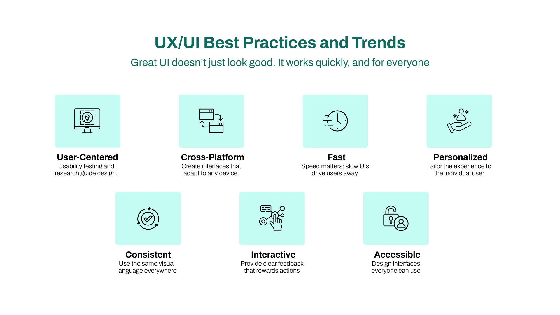
UX/UI Best Practices and Trends from These Case Studies
Great UI doesn’t just look good. It works quickly and for everyone.
What we saw across all these UI design examples and case studies is this:success comes from focusing on the user, not the features.
Some of the most important lessons and trends that stood out in all of these case studies are;
Every brand began with usability testing and deep research. They looked at how people interacted with the product, not how they hoped they would. According to Nielsen Norman Group, usability-focused redesigns result in an average 83% improvement in key metrics. (3)
Your interface has to work on various devices. Most users will access your platform from a phone, not a desktop. A slow, cluttered mobile app will lose people in seconds.
Another thing that we learned is that users won’t wait. Apps like Amazon and TikTok have proven that faster-loading UIs lead to better user engagement. A delay of just one second can reduce conversions by 2%.
Spotify, Netflix, and Monzo all personalized the user experience based on behavior. This makes the interface feel smarter and keeps users engaged longer. Even showing a user’s name or their favorite content category can make a big difference.
Another lesson to learn is to use the same fonts, icon styles, and button placements across your platform. Slack’s interface is a great example; you always know where things are, no matter the screen. A consistent visual language builds trust and removes friction.
Small touches like Duolingo’s green checkmark or Spotify’s button animations help users feel progress. These micro interactions matter. They confirm actions and reduce confusion, making your app feel alive.
Adding dark modes, making fonts readable, and avoiding tiny buttons is also important. Design for all users, not just the average ones. Spotify and Netflix both demonstrate how dark, contrast-rich UIs can be both visually appealing and usable.
In conclusion, you don’t have to guess what users want. Just ask them. Watch them. And then test small changes fast. That’s what turns good UI design into a great user experience.
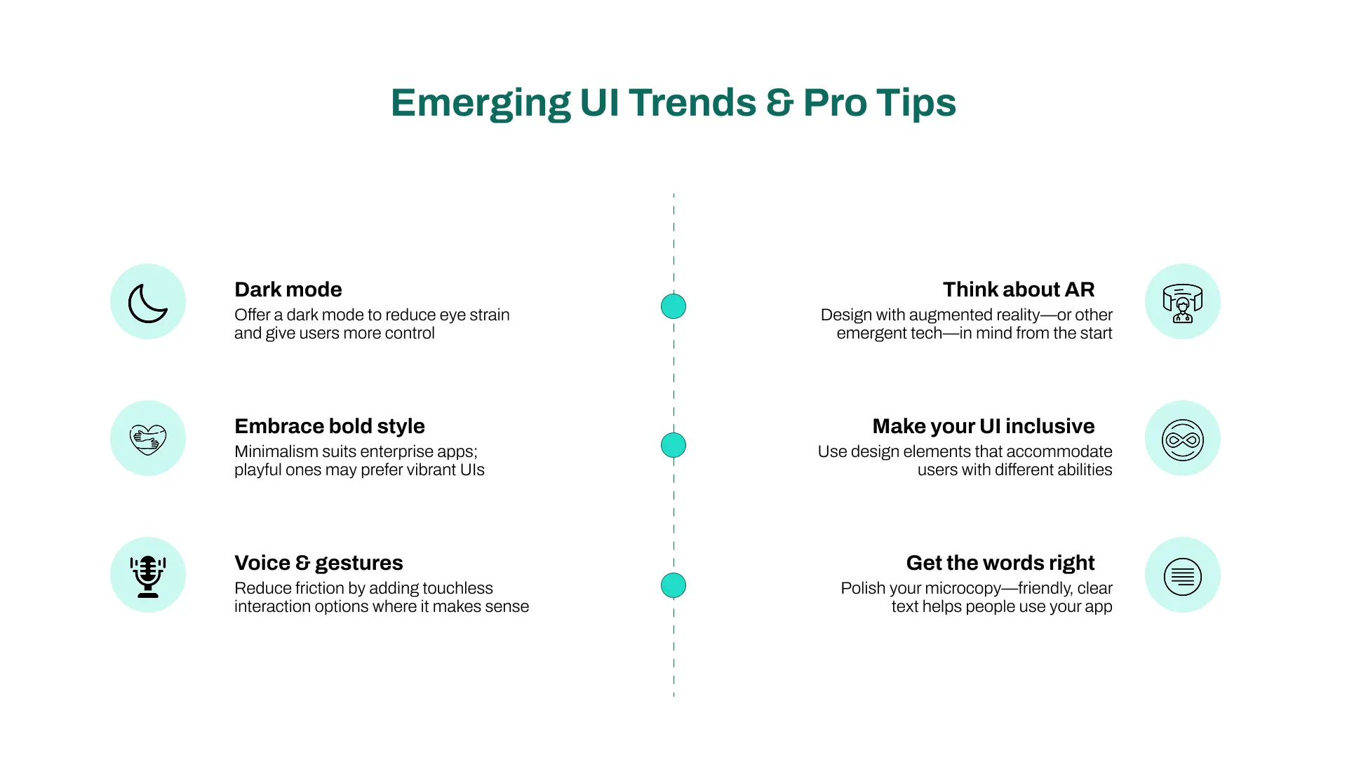
Emerging UI Trends & Pro Tips
UI design doesn’t stand still. It changes with how we live, work, and connect. What felt cutting-edge a year ago might already feel outdated today.
One big shift? Dark mode. It’s everywhere now, not just for looks, but to reduce eye strain and give users control over their viewing experience. Adding a theme toggle early in your UI UX design process makes your app feel more modern and user-friendly.
In fact, according to Android Authority, 81.9% of users say they prefer dark mode when it’s an option. (4)
Minimalist design has long been the gold standard. But we’re seeing a rise in bold, colorful interfaces, especially in creative apps and kid-friendly platforms. It’s a reminder that design should match your audience. What works in a banking app might feel dull in a gaming one.
Touchless interfaces are also growing. More apps are experimenting with voice commands and gesture-based controls. It’s all about reducing the friction of clicks and taps. Even if your app isn’t voice-first, designing for gesture-friendly navigation can reduce the learning curve.
Augmented Reality (AR) is no longer optional in some industries. Whether it's trying on glasses virtually or placing furniture in a living room, AR demands a different kind of user interface; one that’s lightweight, clear, and intuitive. If you’re planning a new design, don’t tack AR on later. Build with it in mind from the start.
And then there’s AI.
We’ve seen it used in everything from playlist suggestions (Spotify) to smart UI generation (Figma AI). AI can help personalize your user experience, automate design tasks, and surface the right content at the right time. But remember, AI is only helpful if it’s tested and reviewed by real users.
Inclusivity is another major trend. Around 15% of users have some form of color blindness or accessibility challenge. Designing for them with clear labels, readable fonts, and high-contrast design elements isn’t just thoughtful. It’s essential.
Microcopy matters too. Those tiny text labels like “You’re muted” or “Saved” often make or break an interaction. Clear, friendly language is one of the simplest ways to make your interface feel human.
In short: design with care. Test with purpose. And never stop learning from how people use what you build.
Conclusion: Great UI Doesn’t Happen by Accident
Behind every great user interface is a clear intention: to help people achieve something with less effort.
None of the apps we explored became successful by chance. Each one followed a thoughtful UI design process, backed by usability testing and user data.
These UI design examples and case studies prove that when you put users first, everything else follows: clarity, trust, and engagement.
Whether it's Airbnb guiding travelers or Slack simplifying team chat, each example shows how great design decisions lead to a better user experience.
And here’s the truth:
Users notice. They also reward great design.
So don’t just design something that works. Design something that works well across screen sizes, on various devices, and in ways that feel effortless to the people using it.
And if you're creating your own mobile app, platform, or website, start small. Test often. Keep improving.
The result?
A product that doesn't just look nice, but drives results.
Areesha is a content writer with over 2 years of experience in writing about tech and digital trends. She focuses on topics like AI, remote work, and productivity.
Her blogs have helped startups grow their content reach and improve lead generation. She writes with a focus on clarity, simplicity, and reader value.
Oops! Something went wrong while submitting the form.
Cookie Settings
We use cookies to provide you with the best possible experience. They also allow us to analyze user behavior in order to constantly improve the website for you.


